It's been one of those weeks. First a younger family member through her intelligence and very hard and dedicated efforts received the choices that others in her field can only dream about. Here's raising a glass to her in celebration. Then another--who because of her years and experience--should be even wiser--chose possessions and money over family. Grrrr!!!! I guess it takes all kinds.
I realize that I need to work in joyous colors. Make a smaller wall hanging--maybe similar to this
study in blue I made a few days ago. After all the
Baltimore Craft Show is at the end of this month. I must work hard.
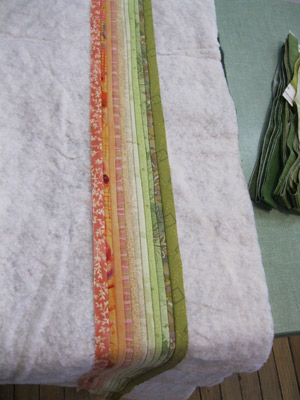
I do love working with the thin strips of fabric. How intense they make the colors. How lovely the texture is. I groan at the amount of effort. The endless concentrated sewing. I am not sure I want to make another color study like the blue study. So I look around the studio--find this small square quilt that I made. What will happen if I extend this piece--make the horizon longer. Can I make the colors sing so that the horizon is a dream one can fall into? Or will it just look awkward and forced?
Well sometimes there is only one way to find out. So I arrange the greens on the table. Yes, I confess I use my sewing machine table to lay out the fabrics right now. The best light in the studio. Sigh!!!
Not bad. Not sure about all of the oranges and rusts. The figured yellow does stand out--but I used it in the small square and it worked there. You never know unless you try, right? Hmm.
Now I confess I am still fascinated with tangerine--tangerine tango to be precise. According to Pantone it is "The Color of the Year." You can check it out at
Pantone Color of the Year. What an interesting choice--warm and bright--vibrant. They describe it as "(s)ophisticated but at the same time dramatic and seductive."
And yet there is also something haunting about it. Do I have too many memories from earlier times? The fake leather chair we had--so very very mod--if you know what I mean? I go onto Pinterest and create a board of tangerine accents--even there the pickings are slim. You can check out my board here
http://pinterest.com/annbrauer/tangerine-tango/.
Instead the only way is to start sewing. Long seams.
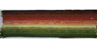
Hard to tell if this orange is too bright.
The greens are pretty easy. I precut them and sew them in long rows. The tangerines are harder. I have to choose new ones after I piece the last.
So slowly it goes. I need darker colors at the top to balance and weight it. To help tell the story. Amazing how the brighter colors blend in when they are surrounded by more colors.
Finally I can pin it up. As the day comes to an end the colors of the quilt become brighter than the photographed image but still I wonder. Is this just decorative or does it tell a story? What will it look like when it is truly finished? The edges turned and bound. The quilt hung on the wall. Sometimes it is the finishing of the work that creates the image? Should the green be softer, more muted? Was I too scared of creating the horizon? Should I take more time--more soft yellows and oranges? What will the quilt look like today when I see it fresh in the studio?
Or is it that tangerine tango is just a hard color to attain? What do you think? Do you ever work with orange--or should I say tangerine?