Wednesday, January 18, 2017

Baltimore postcard

I love the fact that the American Craft Council now gives you a template with their log so you can design your own postcard. Thanks to the help of my DH, my cards are now being printed. Great idea, Craft Council. Hope to see some of you there.  For more information:  Baltimore Craft Show.

Here's the front. What do you think?

Baltimore postcard Copyright Ann Brauer 2017


 And the back.

Baltimore card--copyright Ann Brauer 2017


Now to get more work done.


Sunday, January 8, 2017

no more excuses


Sometimes you know--you just have to start. Sure I have memorized the images of the space until I know the colors and the angles by heart.  I have played with fabrics shopping for new ones and more of those I know want to use. Thinking about what will work in those wee hours of the morning as I think about getting up. Sketching designs in my mind as I drive to the studio or finish some hand sewing. 

But now--the holidays are over. I have deadlines and no more excuses. I need to begin.  There are so many possibilities. So many questions of scale that I need to address. Sometimes though for me that best way is to just start. See what I can learn by working at this scale. Will it be like I anticipated? Are the colors going to be right? Will the shape and movement be right? What will I want to do differently? What are the technical issues of this scale that are different from smaller quilts?

Sure I have made quilts that are this size before. "Sunrise" was 30 x 80 inches. I know I can do that.

sunrise--30x80"--quilt--Ann Brauer 2015
My quilt "distant flame" was vertical and also about the right size at 36x80 inches although I fear that three of these quilts would be too busy for the space.

distant fire--36x80"--ann brauer--2015

There is also my quilt "blue dream". I love how organically the "grasses" stretch to the sky but I wonder how it will translate when each panel is three times as wide. Three panels with three separate grasses could be too much for the space. What will happen when each panel becomes wider and shorter. Will it still have the same grace or will it look boring as a block of color?

blue dream--38x100 inches--ann brauer--2015


This time the mission is to create three matching wall hangings in three different colors in my "flame" or "marsh grass"series to hang in an entry way. The colors of the space are soft and floral but also sophisticated. I don't want it to be too busy. There is a lot of subtle design in the space. But I also don't want it to be too subtle that it fades into the background. The three quilts that have been ordered are each to be about 32x72 inches. Size does matter. It will be important to get the flowing grasses within this concept and have the three quilts look unified together.

What about "marsh moon"?  I love the glimpses of light peeking through the grasses? If I use the same feeling of light in all three panels will that tie the work together? Granted it will need some work to get the size right? But what will happen when I make three of them in the colors of the rug? Like three versions of the day? Will it be too busy or will the detail work perfectly to complement the rug.

marsh moon--work in progress--about 36x60 inches--ann brauer--2016

Hmmm. Well sometimes the only way to find out is to start. There is a lot I will learn by actually making the quilt and seeing how it works. After all, the worst case is I have a finished quilt that is not quite right for the space but that has taught me how to think this big. Nothing wrong with that, is there? And I do want to get this order done before the Baltimore Craft Show in February. Oh so much to do, isn't there?

Now before I begin this blog series I want to alert my readers, this will not be a how-to post. My goal in this post--and indeed in all of my blogs--is not to show how to make a quilt just like mine but instead to suggest how I think when I am making a quilt--the questions I ask and how I muddle through to get the right finished product in the hope that some of these same questions and methods will help you make the quilts that you imagine and want to create.


Tuesday, January 3, 2017

Beetle in the Leaves--work of Sarah Crowner

Although I am not one to make lists or resolutions for the New Year, I do find it a time to pause just a moment and think of the larger questions. Where is my work going? Where can I take it? And most importantly, where do I want to take it? How do I unify my work so that it pushes beyond craft to make a larger statement? Always great questions that I can only nibble at in the broader scope of life.

Still it is what keeps me going and what interests me about the slow process of making quilts.

So for the New Year, I just had to see the new exhibit of Sarah Crowner at Mass MoCA called "Beetle in the Leaves"  where she combines the techniques of sewing and piecing to create abstract paintings that reflect contemporary life. These are paired with assembled pieces of tile that are either floors that can be walked on or wall art to contemplate. Or at least that was what the blurbs said about her work.

I was sold on the concept. When I first walked into the space the scale was impressive. Three large rooms with large paintings and a large tile floor. Such interesting shapes in the paintings--for that is what they are called and I think that word matters.  Don't you love the simple but complex spaces in this work.

sarah crowner--mass moca--2017

The tile floor also reflects the geometry and is meant to be walked on with just a few splashes yellow paint to add a hint of design to that space. For me, the floor was part of the whole but less effective by itself although reading the literature the shape does represent a geometric leaf that allows the tiling with a minimum number of joints. Although maybe this was part of the inspiration for the title of the show--just saying.

sarah crowner--mass moca--2017


The colors of blue in this design are painted for even more surface texture. Each one a slightly different shade to make it more complex and rich.

sarah crowner--mass moca--2017


What about the color and shape in this simple design. Such a universal but modern feeling with the thin lines stretching out like birds in flight or leaves on the trees.

sarah crowner--mass moca--2017

Upon closer examination I discovered that even the simple all white designs were composed of different canvas fabrics that had been manipulated and stitched together. But why was it framed in this orange that reminded me of orange from the sixties?

sarah crowner--mass moca---2017


Looking carefully you can see the shapes that evolve. Interestingly she used a dark blue thread for the stitching itself that barely peeks through the seams. Can you see it?

sarah crowner--mass moca--2017

 In another room was a large tile hanging designed specifically for this space. The hanging was about 10 feet high by 20 feet wide with a bench one could sit on to contemplate it.

sarah crowner--mass moca--2017

This picture does not do it justice since each tile was rich in color and design. Looking at it my eye kept choosing first one and then another tile that became my favorite.

sarah crowner--mass moca--2017


Noticing the industrial walls of Mass MoCA it was clear that it had been designed to complement this space and the soft teal that was barely visible on the paint.

sarah crowner--mass moca--2017

The windows added an additional layer of geometry reflected in this tile. It should be noted that the colors seemed brighter than my camera allowed as you will see if you make it to this exhibit.

sarah crowner--mass moca--2017

But then there was the mystery. For on the other wall was one small square painting in orange. What was it doing there? The scale seemed wrong to the point of being absurd and contradictory. However, it had to be intentional for this was a very well-planned exhibit so what was I missing? What a puzzlement?
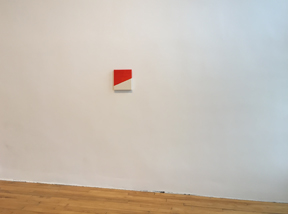
sarah crowner--mass moca 2017

Until I took one final glance back as I left the space and started to walk down the stairs. First I saw how the hints of orange in the two paintings tied in with the orange frames in the next room.

sarah crowner--mass moca--2017


And then--just as a family walked into the third space I saw how that one little orange square beckoned me into the third room. Maybe you can just glimpse it by the man's head.

sarah crowner--mass moca--2017


And though it was time to head home, the exhibition seemed complete and challenging giving me much to think about. What a great day at the museum. The show at Mass MoCA runs through February 12. There is lots more to see at the Museum which is open most days. For more info check out their web site www.massmoca.org

What shows have you seen recently? What has inspired you?


Sunday, January 1, 2017

It's a new day and a new year

It's a new day and a new year. I think there is a song that goes something like that. One of those ear worms that I can barely hear but I think is there. Finally though it is 2017.  Nuf said about 2016.

This is a blog about quilts after all. Now those who know me realize I am not great for setting goals or making lists. I don't do resolutions very well. Indeed I find that it just frustrates me since I can never live up to all my goals or resolutions. Instead I try to set out tasks. One task at a time. I get it done--or as done as it will be for now--and then move on.

One of the tasks that had been lurking over me for years has been a new web site. I loved my old web site--I could do it myself. It was simple to update and while it was not the most elegant web site out there, it had come to have a presence after so many years. Alas though Apple had quit supporting myself, it was not Google friendly and certainly did not work on Mobile devices. (Yes, I had had it for a l-o--n--g time.)

It takes time and energy though to update a web site. Sure I could have paid someone but let's face it--quilt makers don't earn a lot of money. Even if they have been in business for 35 years. At least I don't. I wanted to be able to update it when I needed to--not when I had the money and could hire someone to do it. And I had no clue what I wanted it to look like--even that takes time and energy.

So it sat on the back burner through the studio floating. The new studio. My new quilts. Until finally I could no longer do even the most simple updates. UGH!!!!

OK--time to take matters into my own hands and find a decent template system. One I could manage. That would be SEO friendly. And one where I could understand how to operate it. I tried first one template system. And tore my hair out. Then another that a friend had recommended--no dice. Finally I realized that I was thinking in the same language as WIX and opted for that. Now this is not an ad. Or even an endorsement. But for me it worked. It lets me add my Etsy shop which has been my saving grace throughout this whole experience. It even lets me add my blog post from blogger. I can do this.

So now--I can actually think about what I want to say in my blogs. And I do have a lot to say about inspiration and art. I haven't given my loyal readers input on the OOAK Show in December or my recent trip to Mass MoCA. (Now that was inspirational). I do have a lot of catching up with old friends and making new ones. New quilts to add to the web site. Work on it in my spare time.  And best of all I was able to bring over my old domain so it is still www.annbrauer.com.

Theoretically I can do this while preparing for the Baltimore Craft Show in February, the Paradise Marlboro Show in March, a wonderful gallery show of quilts I am honored to participate in this spring and of course the many events of the Shelburne Falls Business Association.

Which comes full circle to the concept that it is indeed a new day. Get the pun in the quilt.

Happy New Year. Together we will survive.